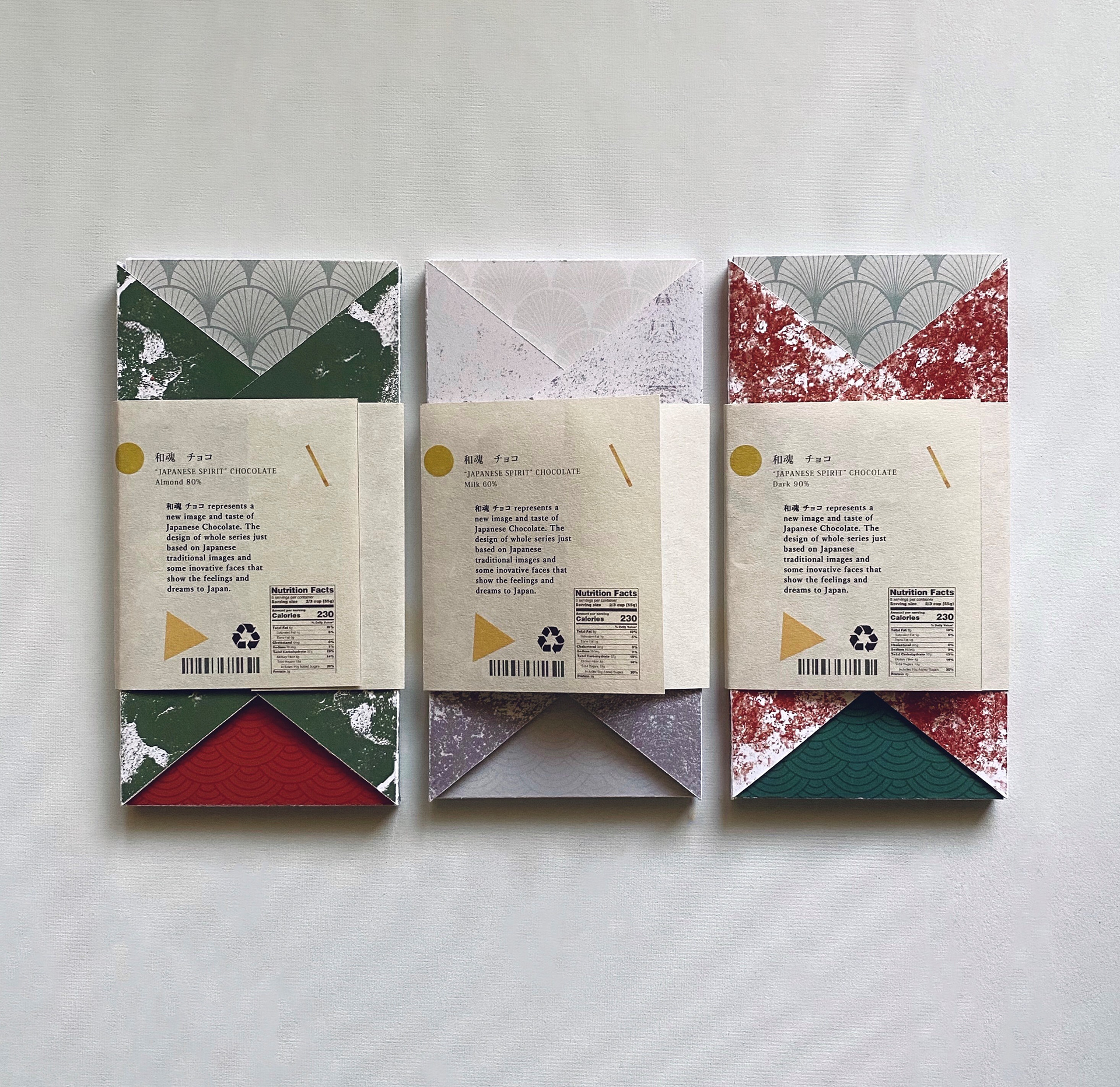
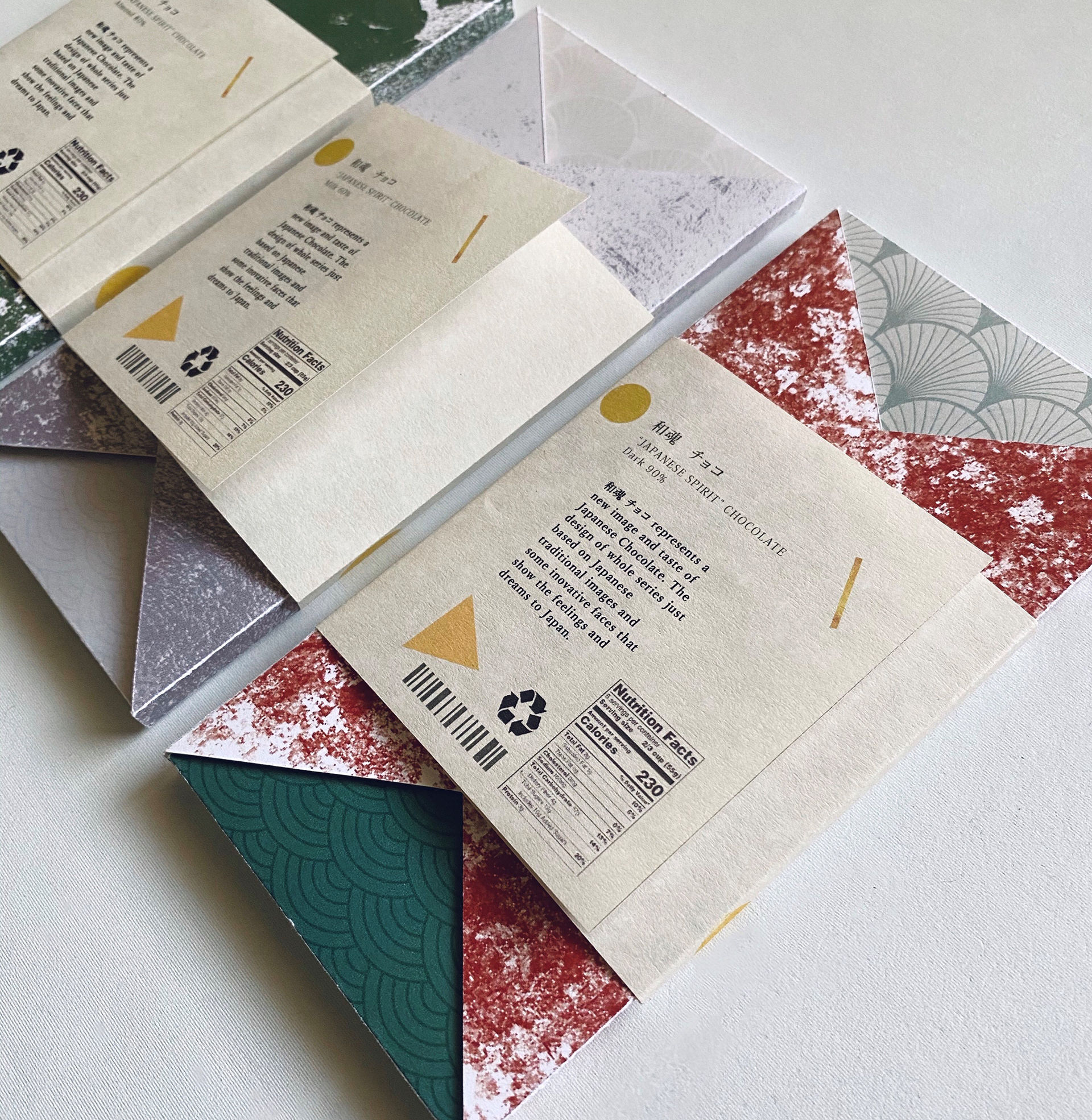
和魂巧克力 和こん チョコ 包裝設計
Wa Kon Chocolate Package Design
中國文化以及日本文化藝術一向在東方美學中極具指標性,和魂巧克力包裝結合了中國書法與日本工藝美學中的幾個元素 : 和服、書道、和紙、金繕,本包裝設計理念在於透過包裝的設計概念於視覺體現東方文化之美,以及讓觸覺感受包裝質感,提升品嘗巧克力時的味覺、視覺享受,成為一系列高質感文化商品。
The Chinese and Japanese art could be considered as the core of Asian aesthetics. The main idea of the Wa Kon Chocolate package design aims at presenting the aesthetics of China, Japan and even Eastern Asia through graphic design and packaging materials. To improve the experience when tasting the chocolate, Wa Kon Chocolate package design based on the Chinese calligraphy and Japanese aesthetics elements such as, Kimono, Japanese paper, and Kintsukuroi (Japanese Traditional Pottery Repairing).
-
包裝尺吋: 152 * 76 * 7 mm

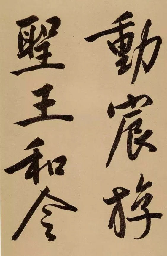
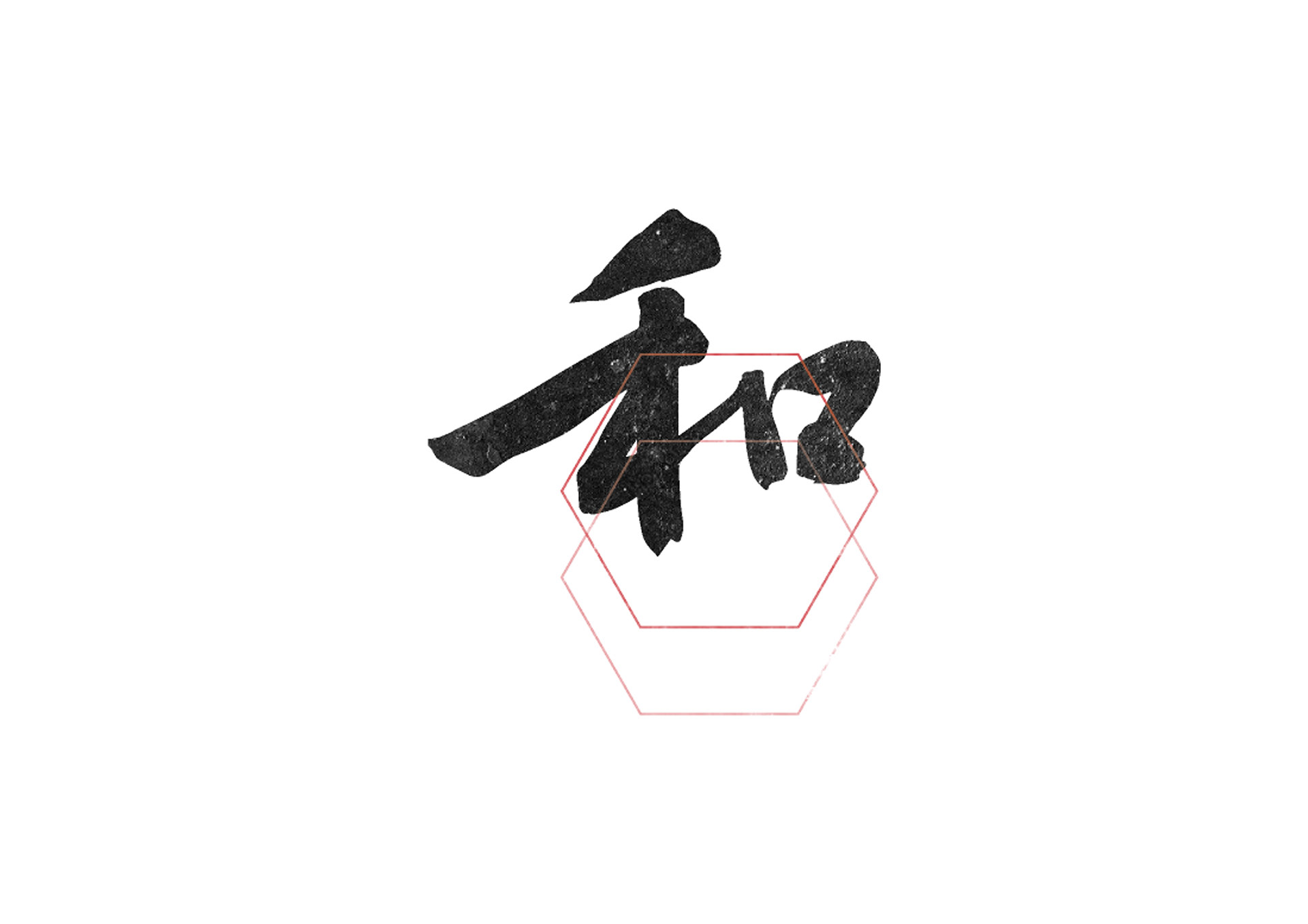
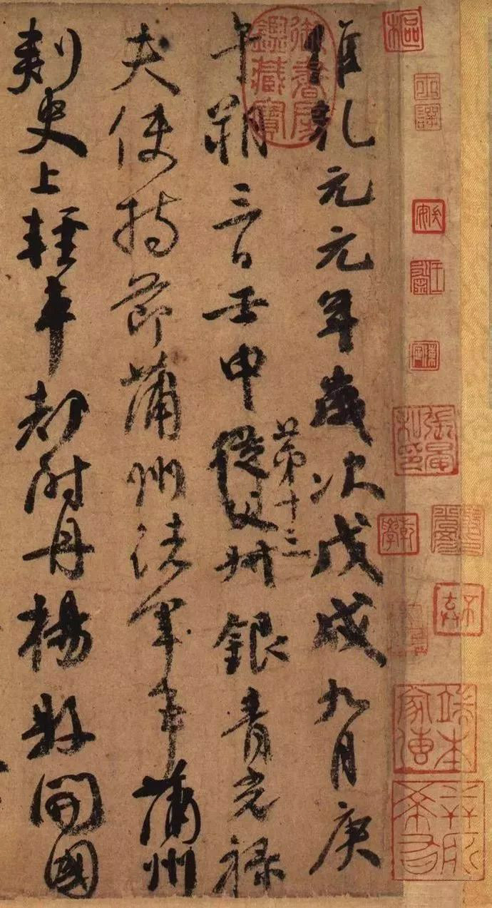
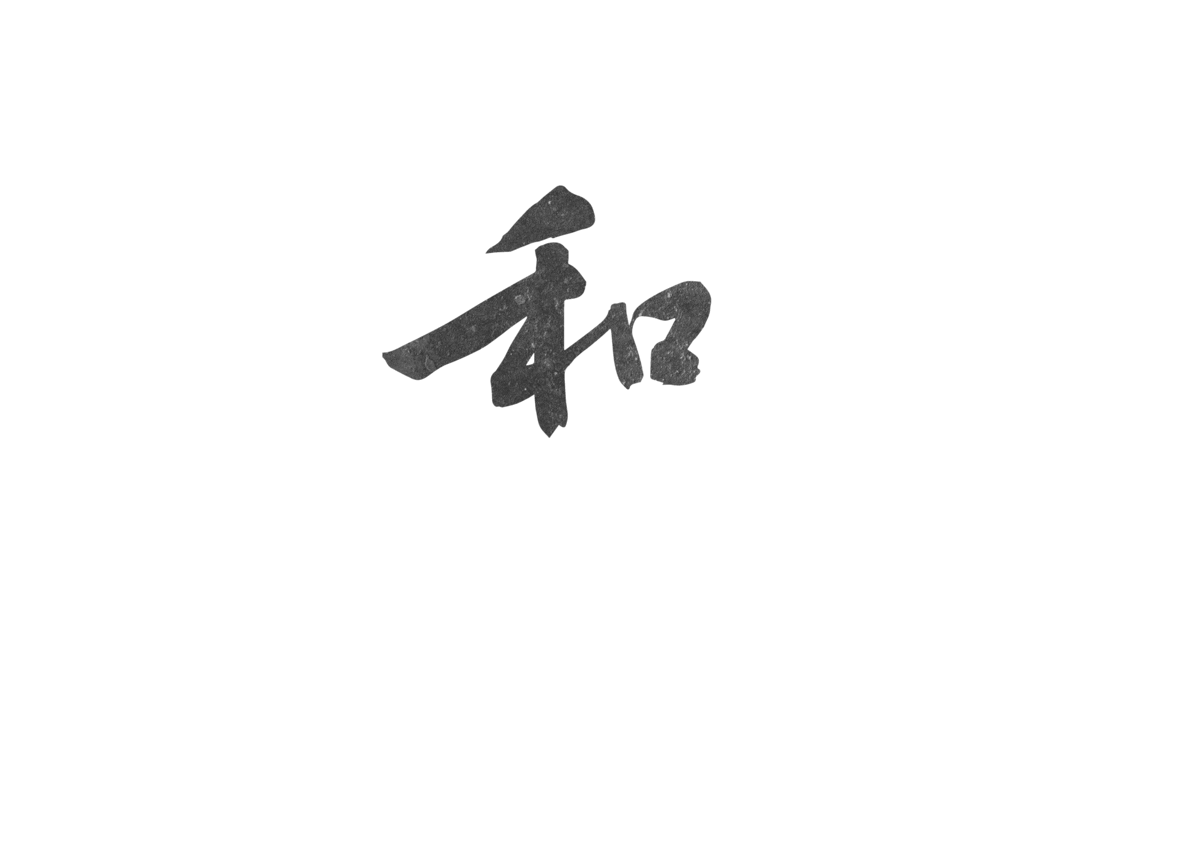
文徵明 (1470–1559) 為明代吳門畫派四大家 工畫 中年後以字行。文徵明之書畫造詣極為全面,其詩、文、畫無一不精。人稱是「四絕」的全才,其書法以兼善諸體聞名,尤擅長行書和小楷。本設計作品之靈感取自文徵明《行書自作書卷 : 立春進賀》之"和"字,其字大氣穩健有力,頗有蘇軾之風,亦有蘭亭筆意。
Wen Zhengming (1470–1559), Chinese painter, calligrapher, and poet during the Ming dynasty. He was regarded as one of the Four Masters of Ming painting and calligraphy. I used the character "和" from Wen Zhengming's semi-cursive calligraphy work《Self work of semi-cursive calligraphy : Spring celebration》as the main typography of the logo. This character "和"(Japanese: /Wa/) has variety meanings, its original meaning is harmony, however, in Japan, people use this word as an icon to represent themselves, today people can also recognize this character as the meaning of "Japan".
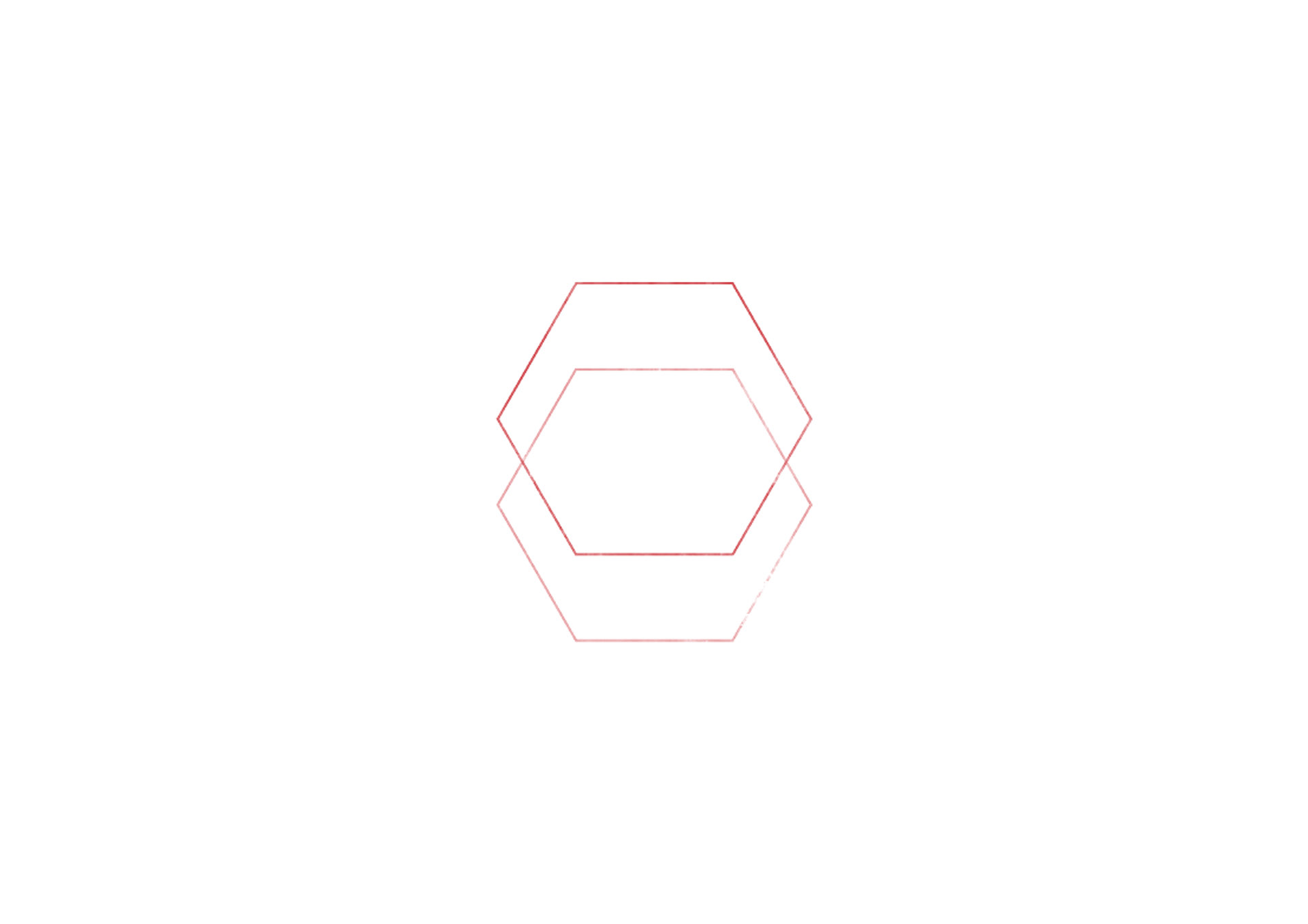
商品的logo的紅底線條設計概念來自簡化東方篆刻藝術,漢字文化圈講究的"天圓地方",在此取一個融合的美意。
東亞書法藝術的一大特色就是書法與落款時的用章,還有日後收藏家鑑賞章之構成。
The red line shape in the logo design was inspired from the Seal Art in Chinese and Japanese culture. A completed art work in East Asia usually has a great the composition of calligraphy, or painting, and seals.


金繕い 在商標設計中的意象
Image of Kintsukuroi in logo design


Date ____ 2020
Designer____張德銓